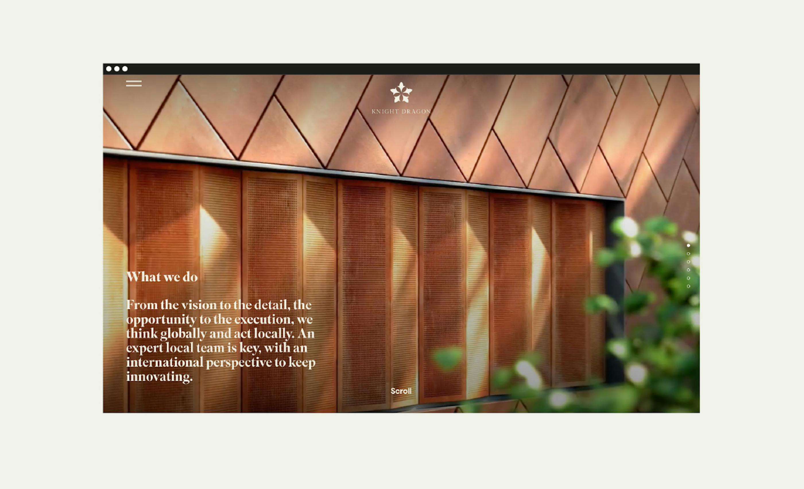
Knight Dragon
Knight Dragon is an entrepreneurial urban regenerator and property developer, setting new standards for modern city living through bold ideas, placemaking, and investment.
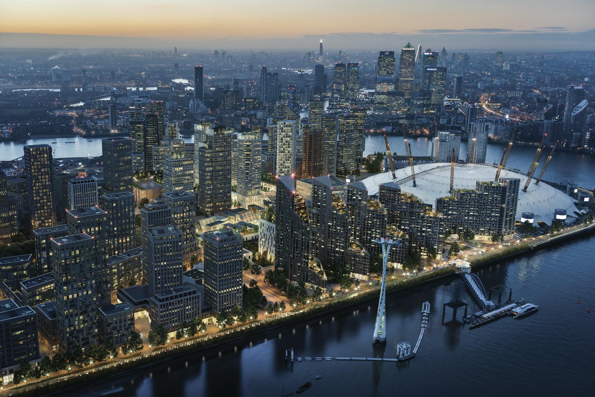
Commissioned to create the brand identity, our work supported the company behind Greenwich Peninsula — one of Europe’s largest regeneration projects, spanning one million square feet in London.
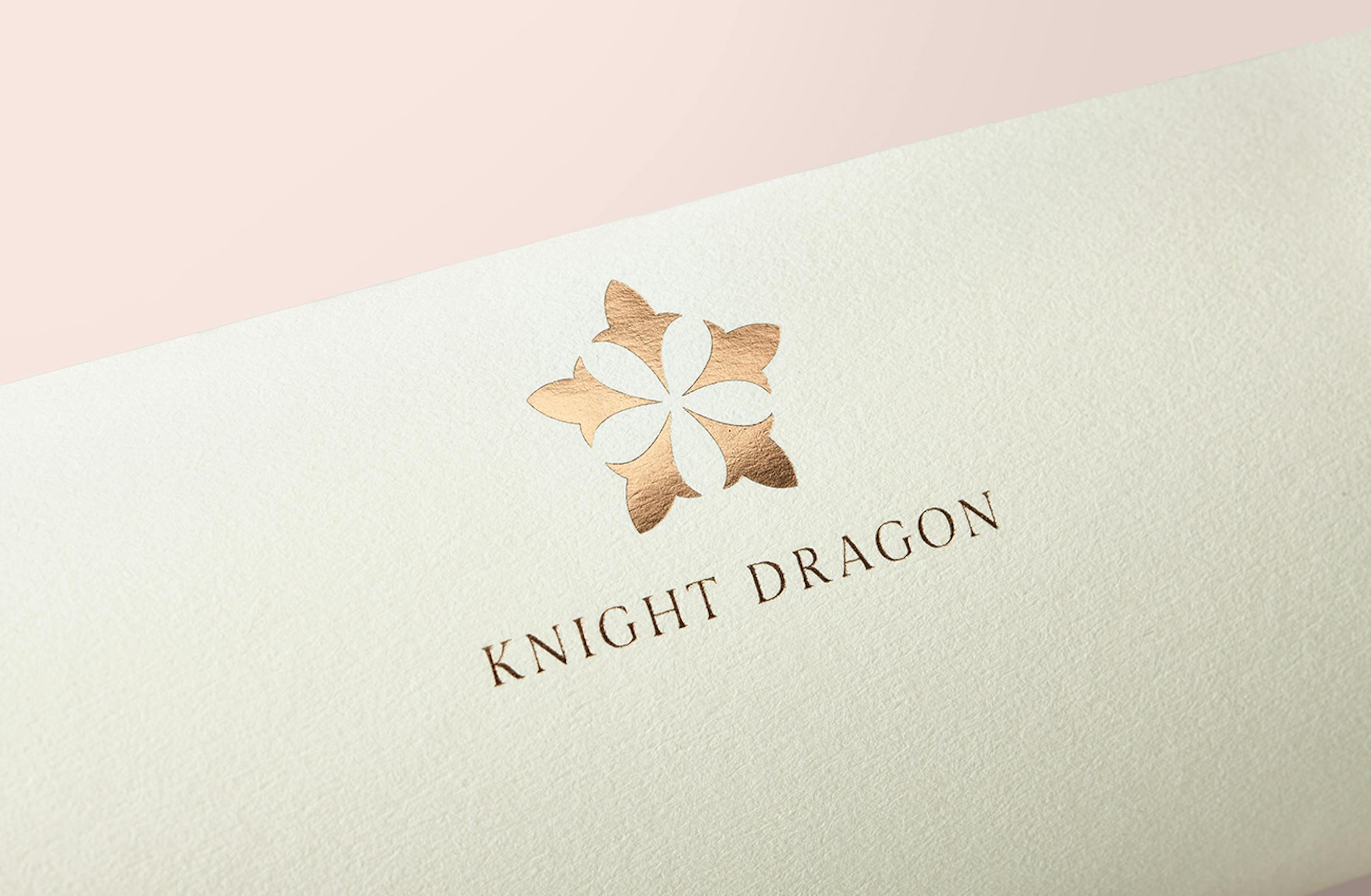
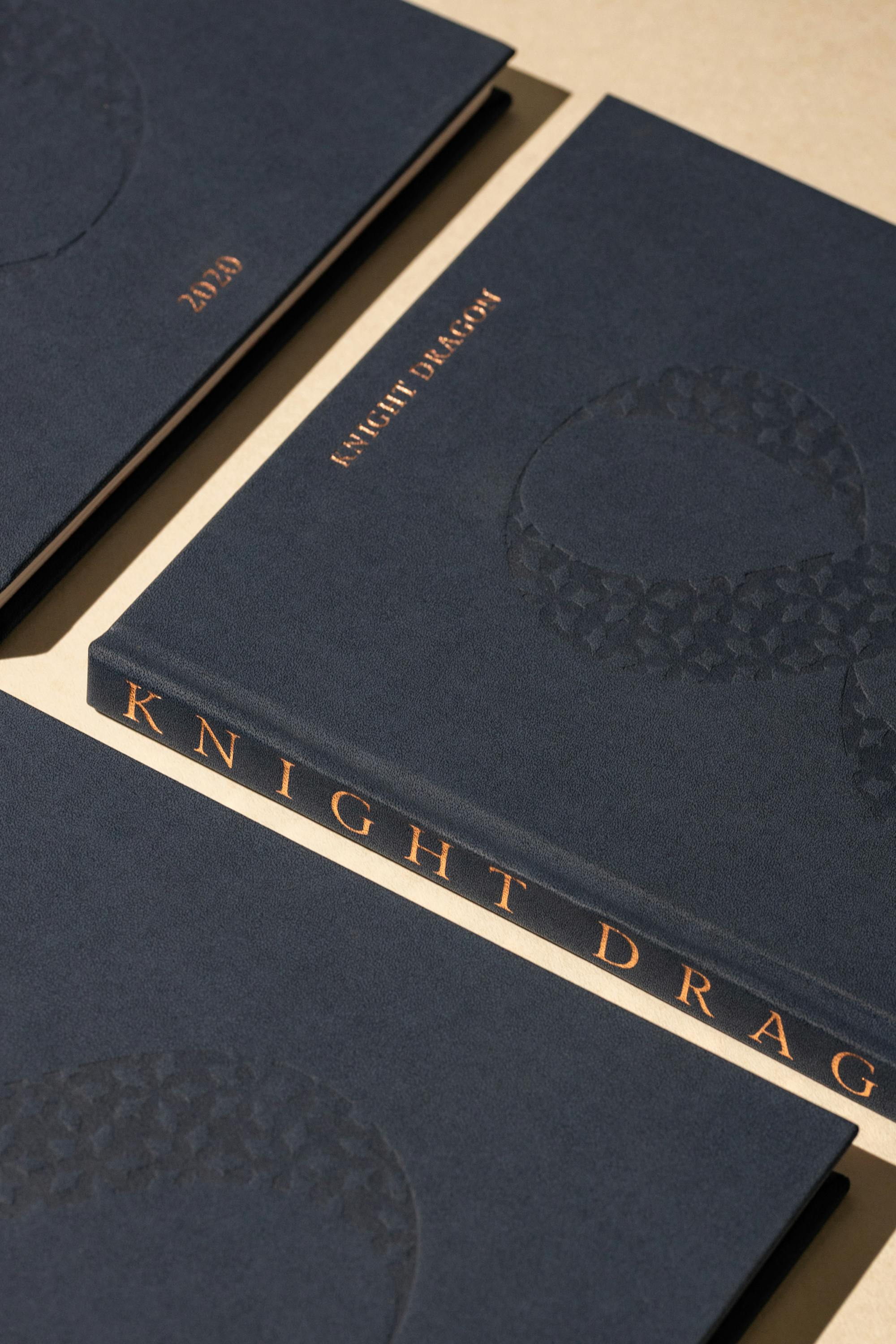
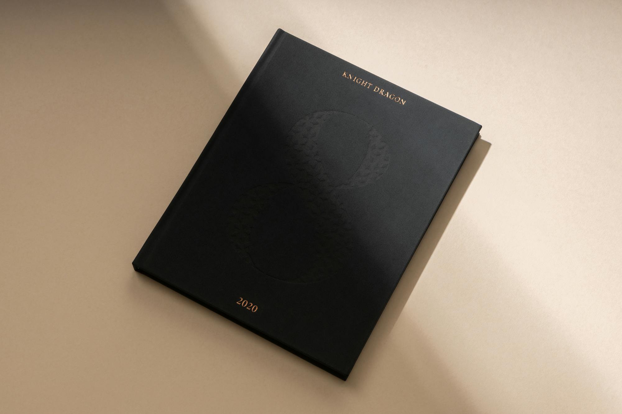
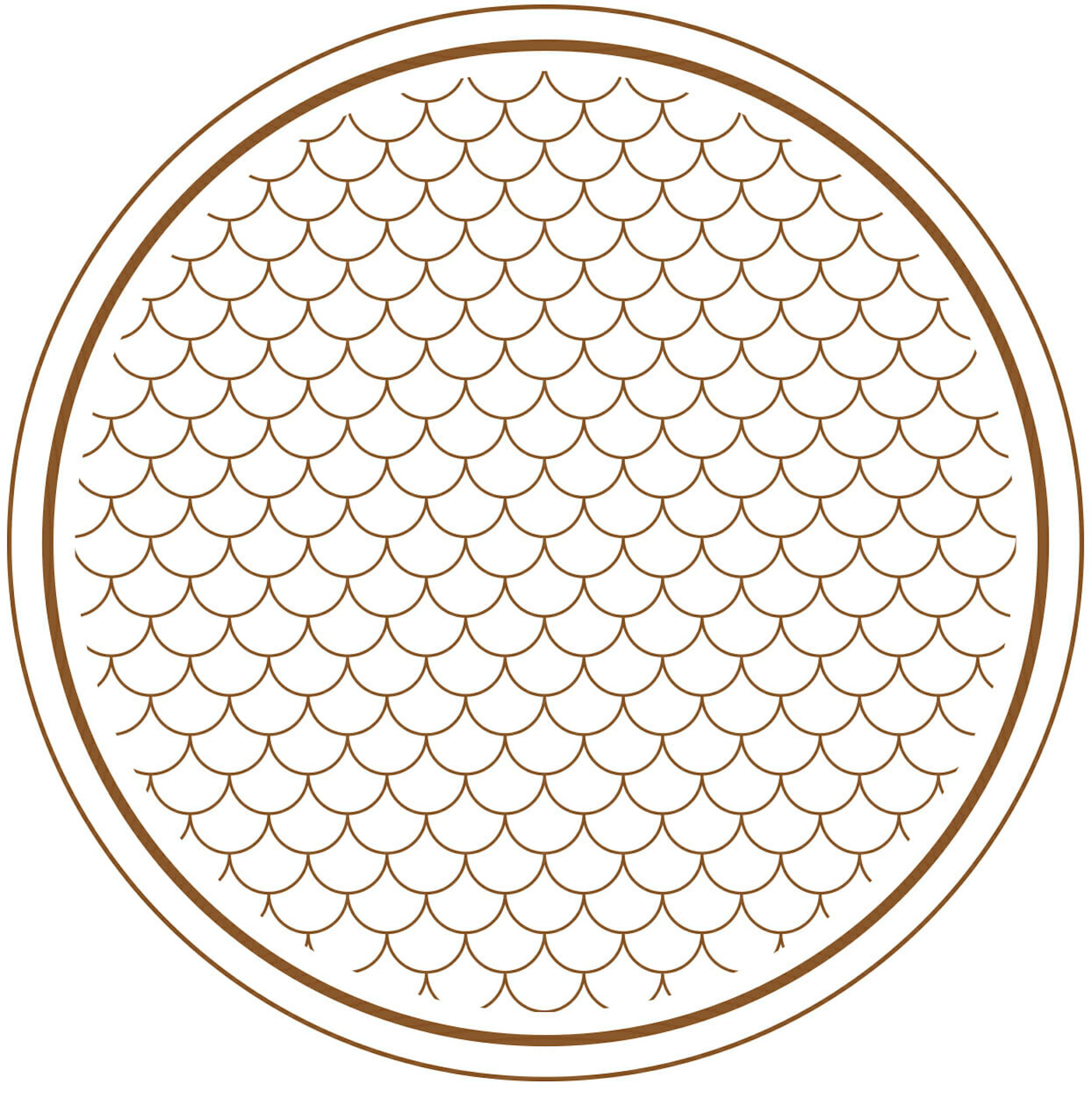
The Knight Dragon symbol is based on the Hong Kong Orchid Tree, Bauhinia Blakeana. With large thick leaves and striking purple-red flowers, the orchid is known as the ‘clever leaf’ and is regarded as a symbol of wisdom.
The negative space on the inside of the symbol reveals a subtle optical illusion – the five-petalled flower.

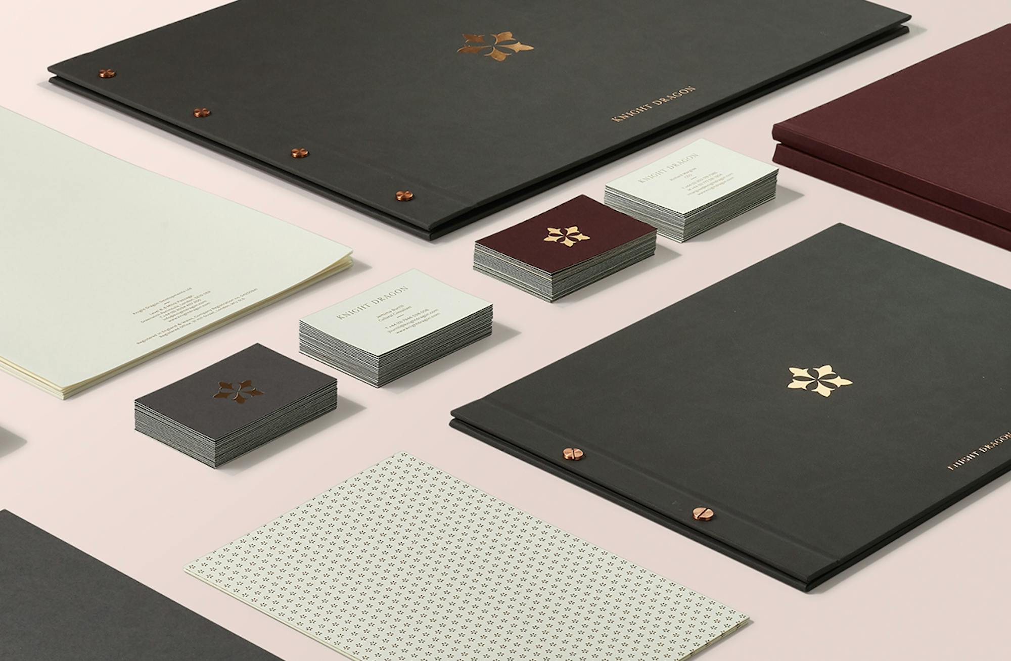
Scope of work: identity design, brand guidelines, art direction, and communications across internal and external channels

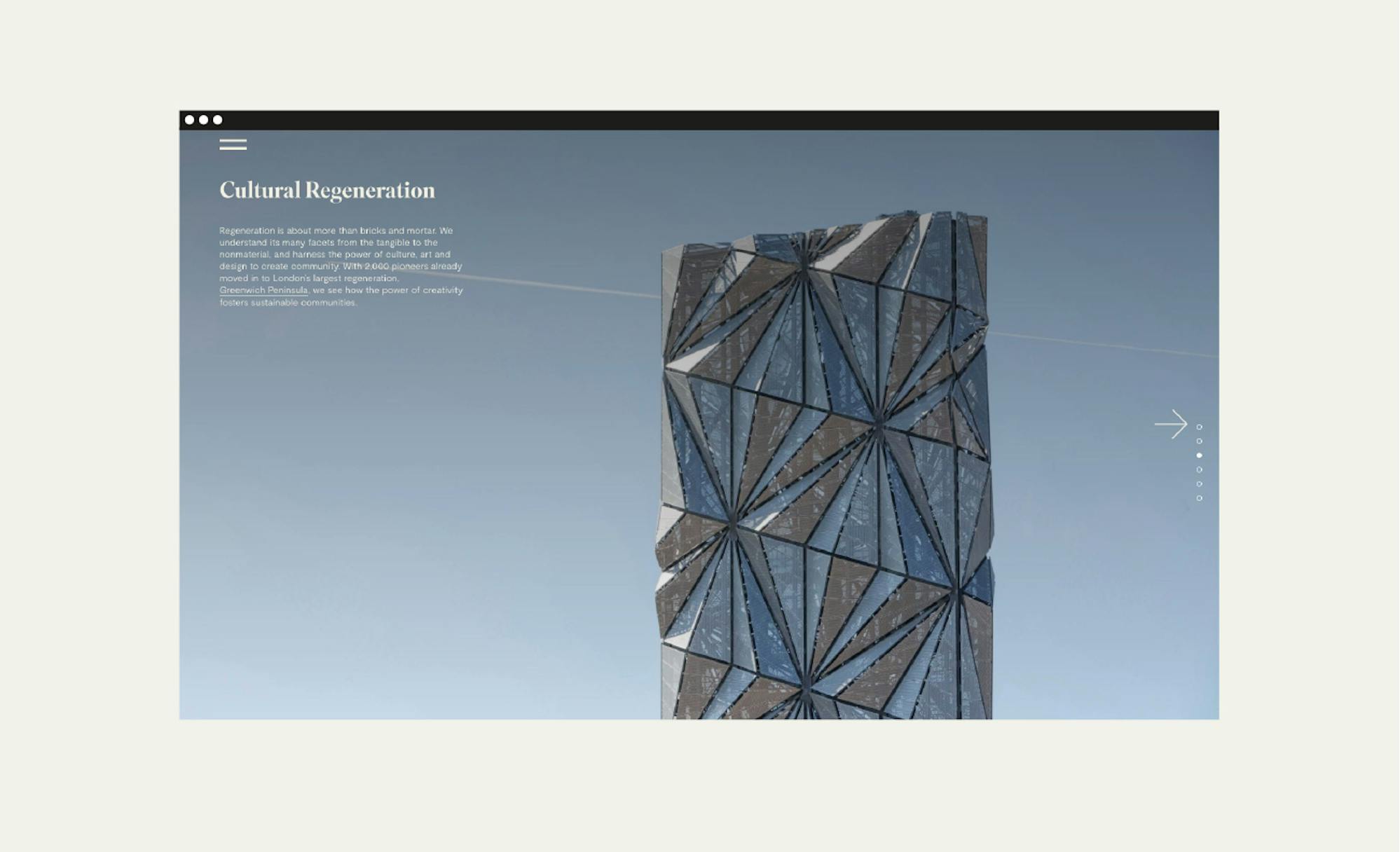
CGI and film footage are indicative only and reflect the Knight Dragon masterplan as envisioned at the time of creation.