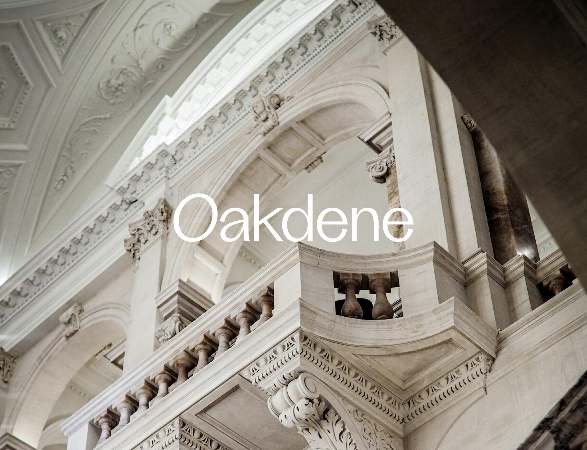
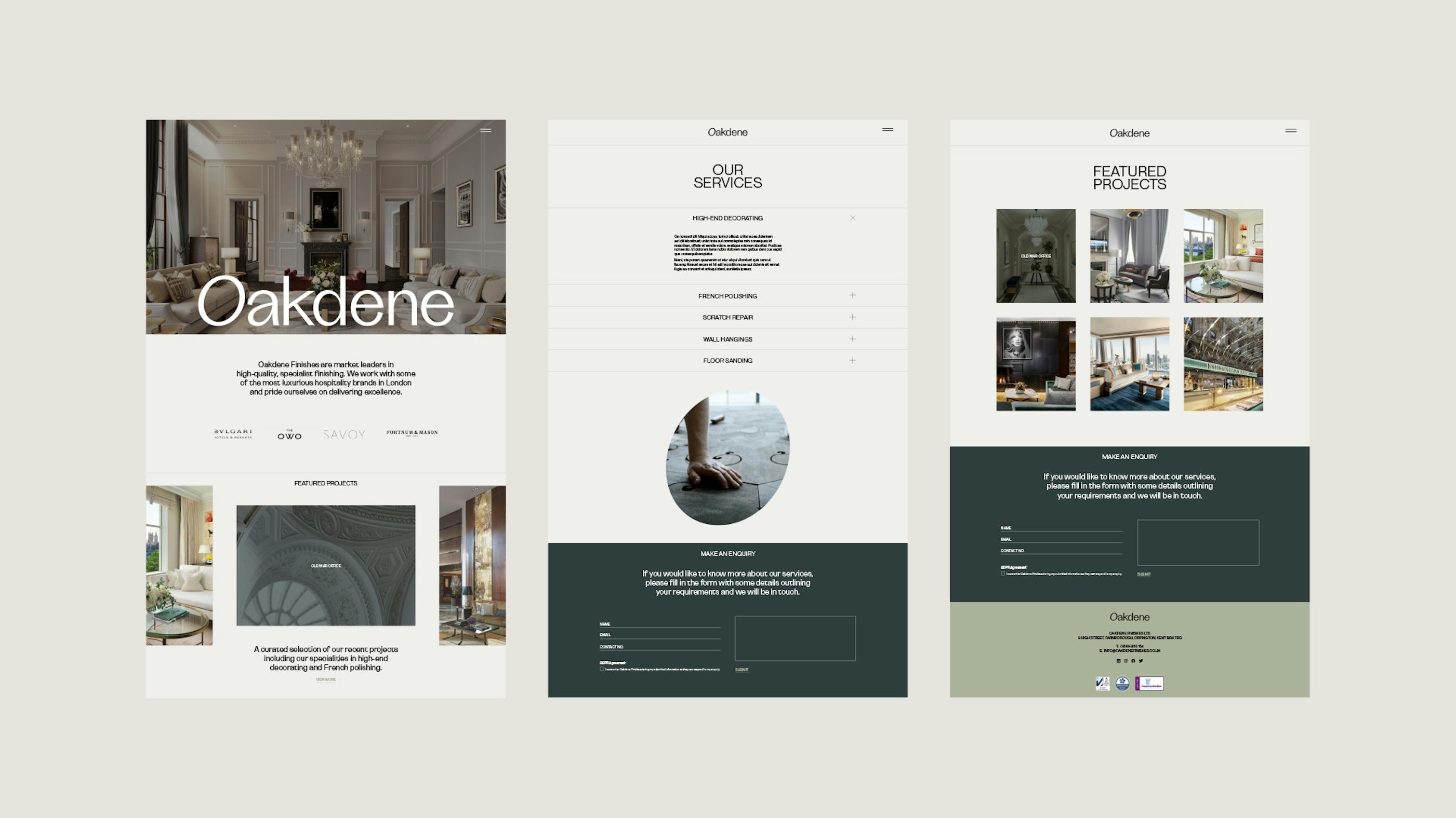
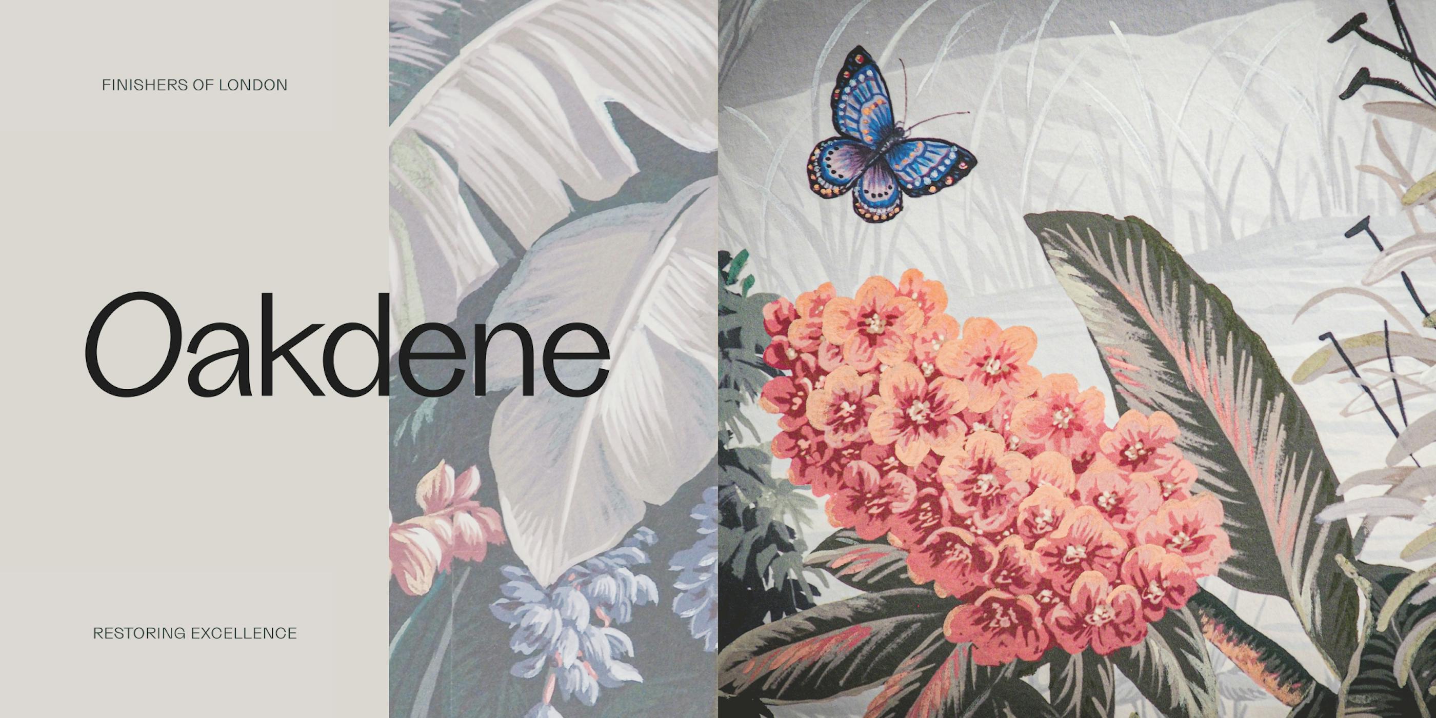
Oakdene
How do you craft a brand identity for a market leader in specialist finishes for London's most prestigious hospitality landmarks?
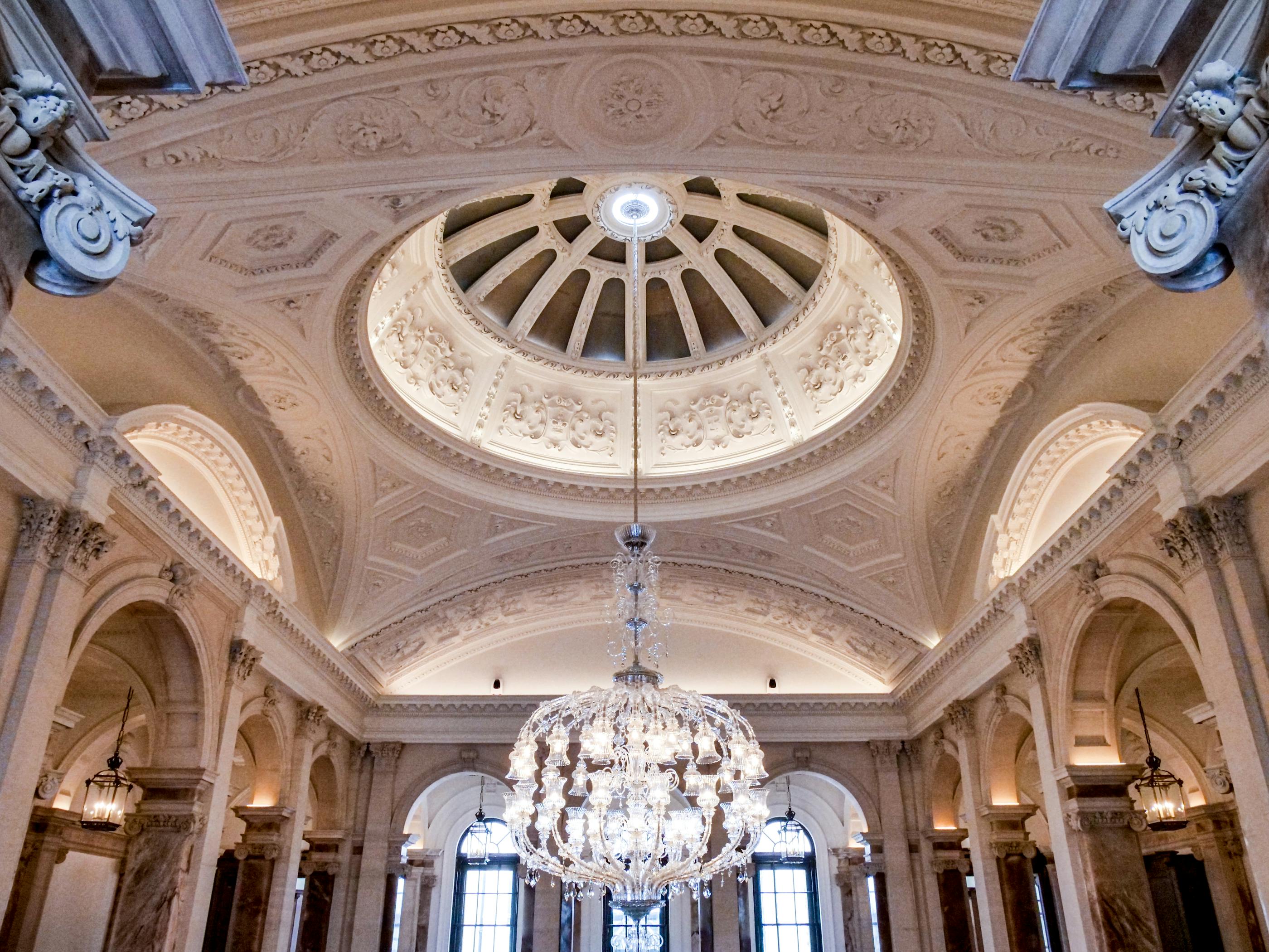
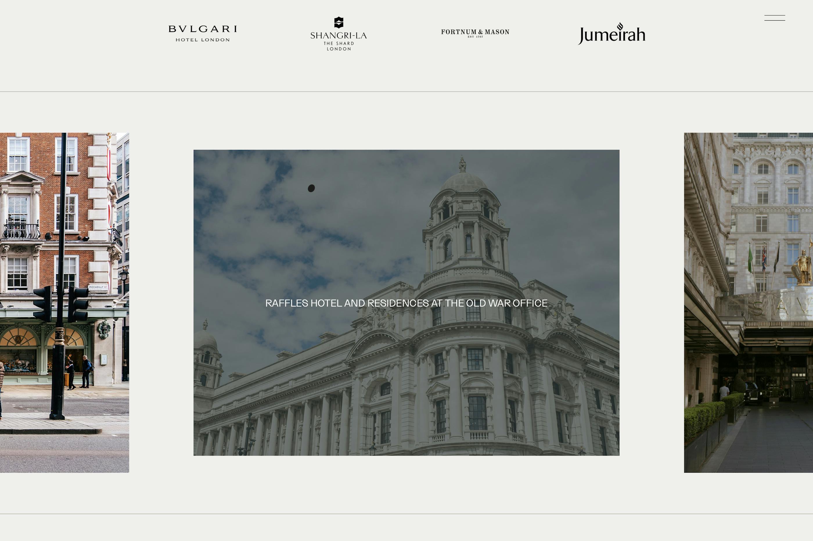
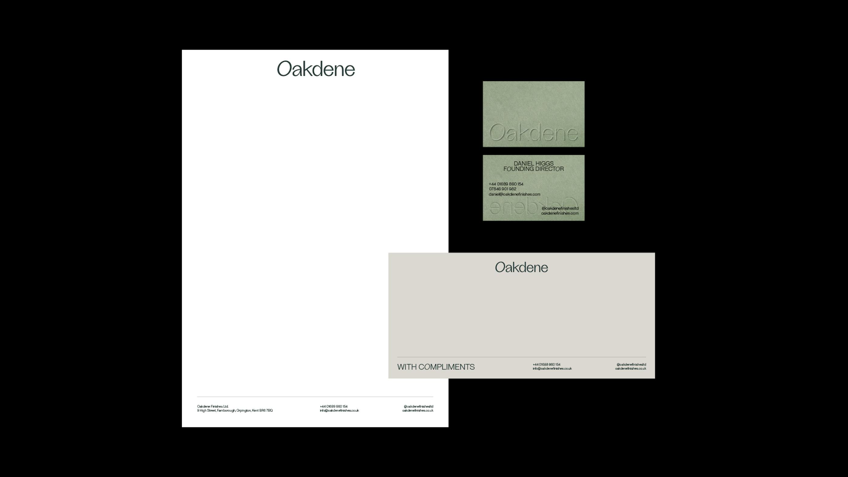
We collaborated with Oakdene to redefine their brand identity and online presence, translating their mastery of exquisite finishes into a sophisticated, modern visual language that reflects their work with icons like The Savoy, Bvlgari, and Fortnum & Mason.
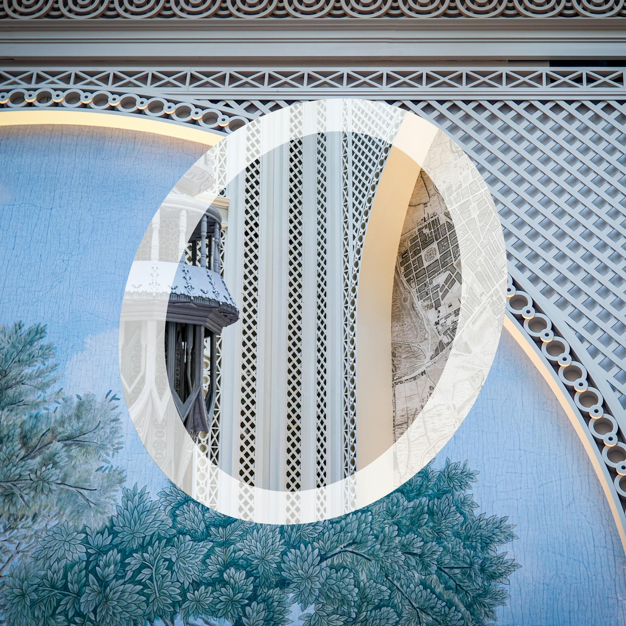
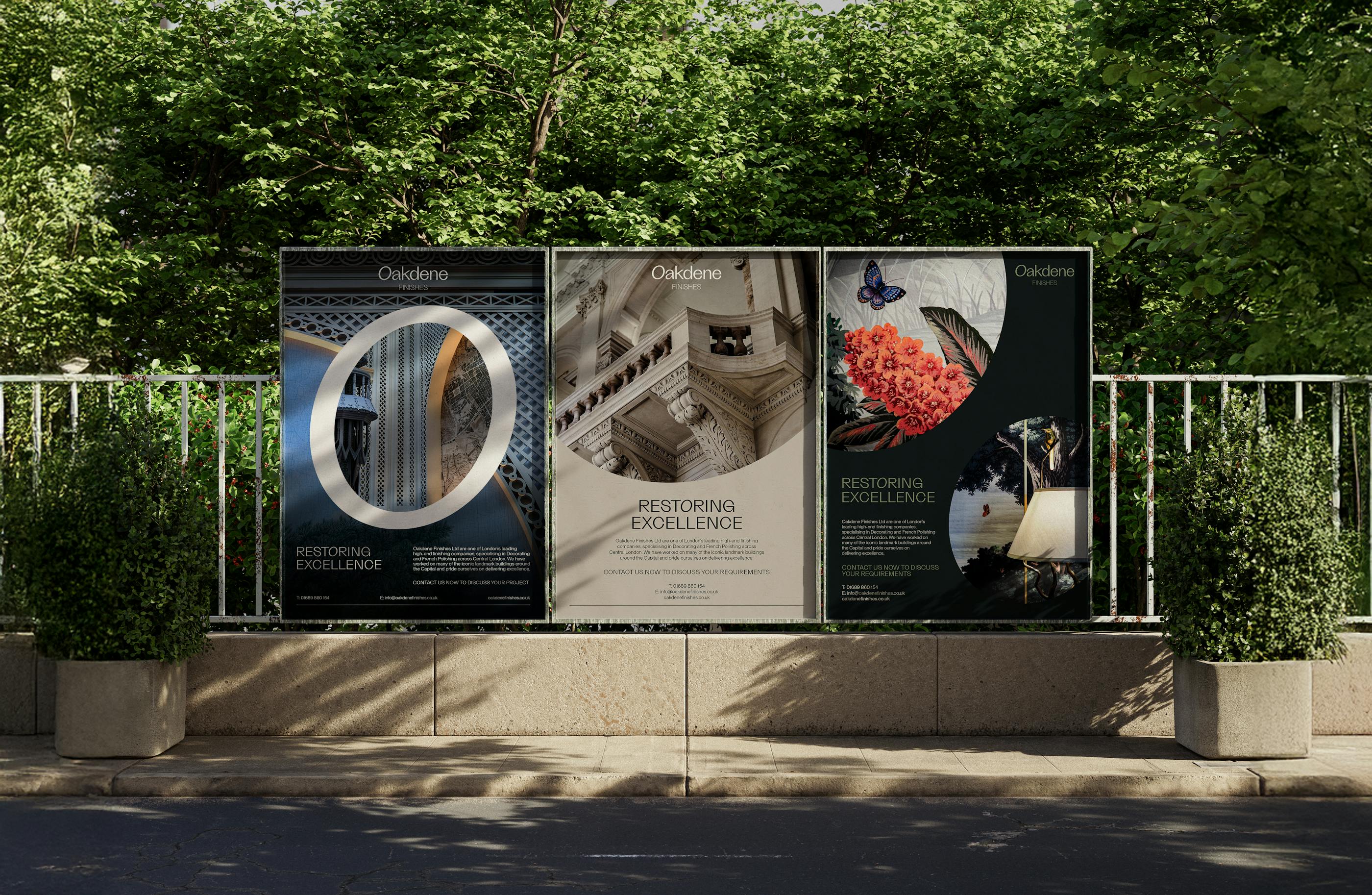
Drawing inspiration from the acorn, an enduring symbol of growth, strength, and craftsmanship, we reimagined the ‘O’ in Oakdene as a mark rooted in the brand’s heritage. The acorn shape connects the identity to wood, nature, and the artisanal skill at the heart of Oakdene’s work. This bespoke symbol functions as both a standalone marque and a visual language, embodying the brand’s commitment to precision, materiality, and timeless quality.
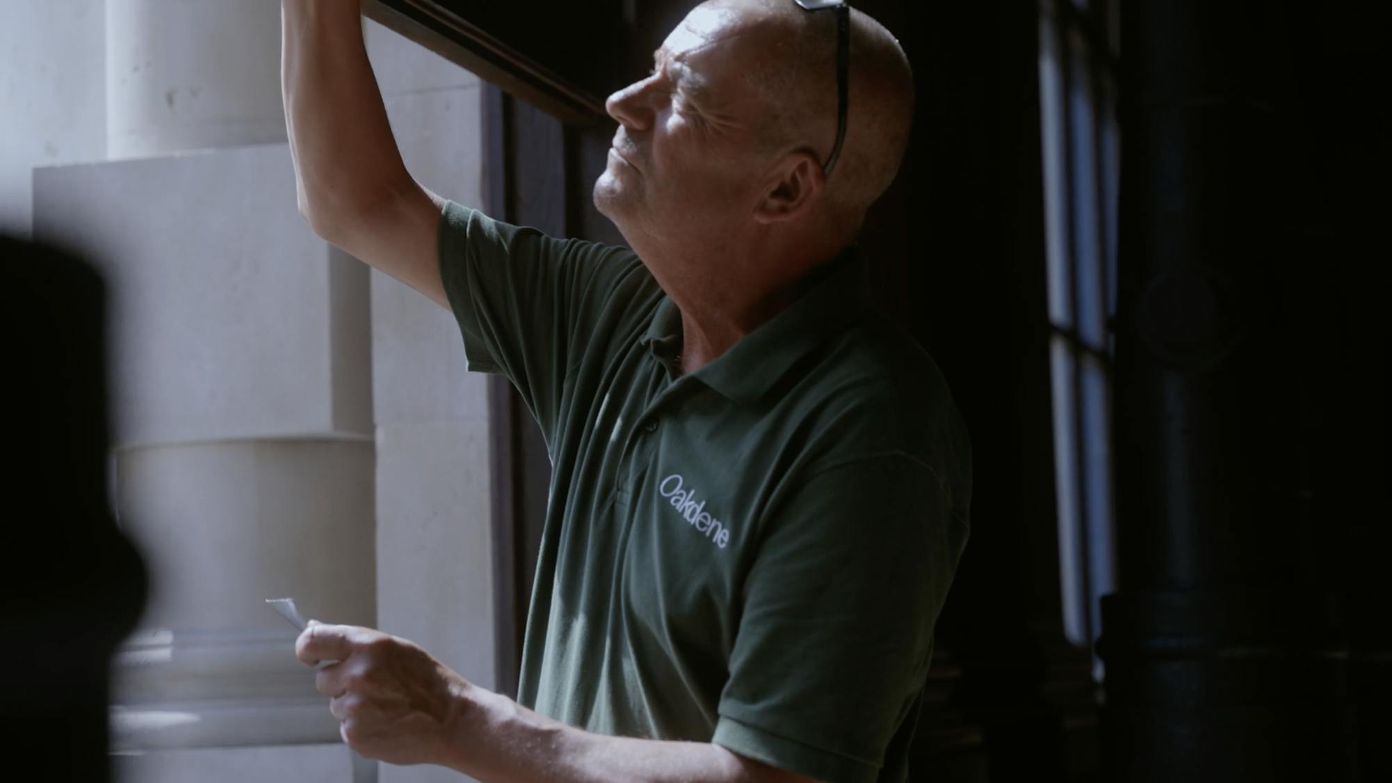
Originally a French Polishing company and led by third generation French Polisher Daniel Higgs, who apprenticed under his father Alan, working at Buckingham Palace servicing the royal household, Oakdene prides itself on retaining it's traditional finishing methods and quality techniques.